We had great fun creating the concepts for Scotia Window and Doors Mascot. Why use a Mascot?
Sourcing a soft toy version of a litter of puppies as giveaways.
Litter of 10 Sotia Scottie Dog Pups
– The pups were actually ‘doorstops’ to be used in the home.
– We ran a competition to win the puppies – everyone loves soft toys!
– Each pup had a lovely Scottish name.
– The name tags and collars were made in Scotia corporate blue to contrast with the red puppies.
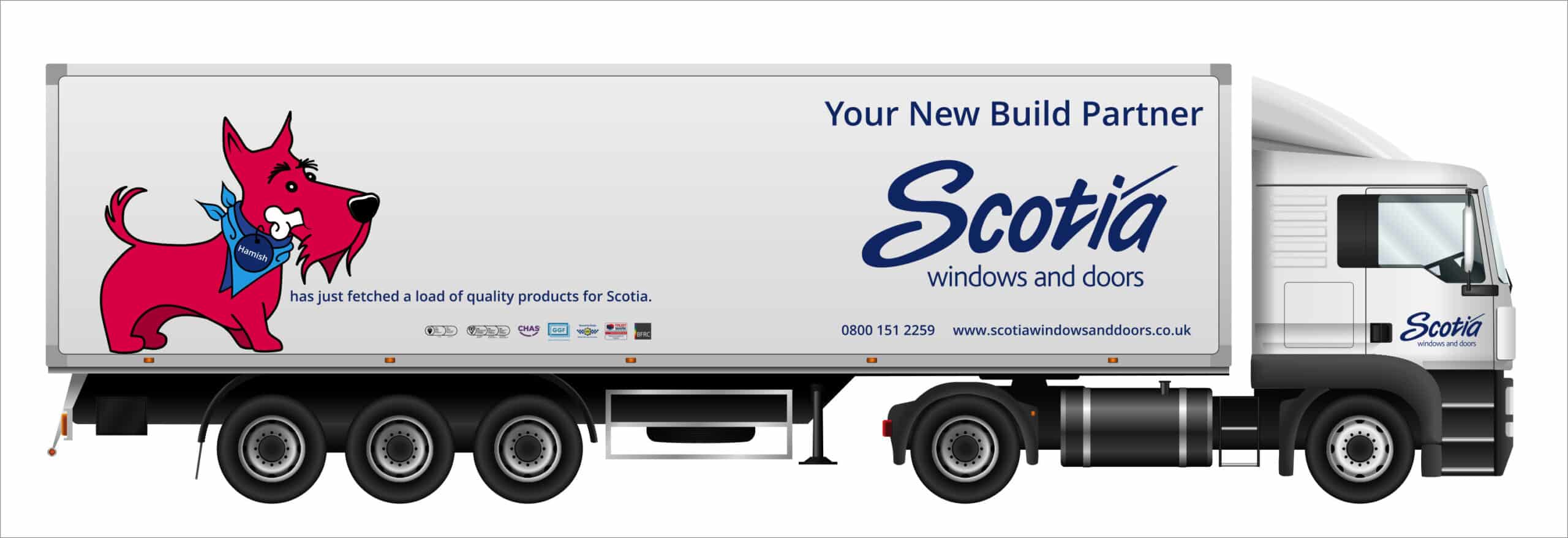
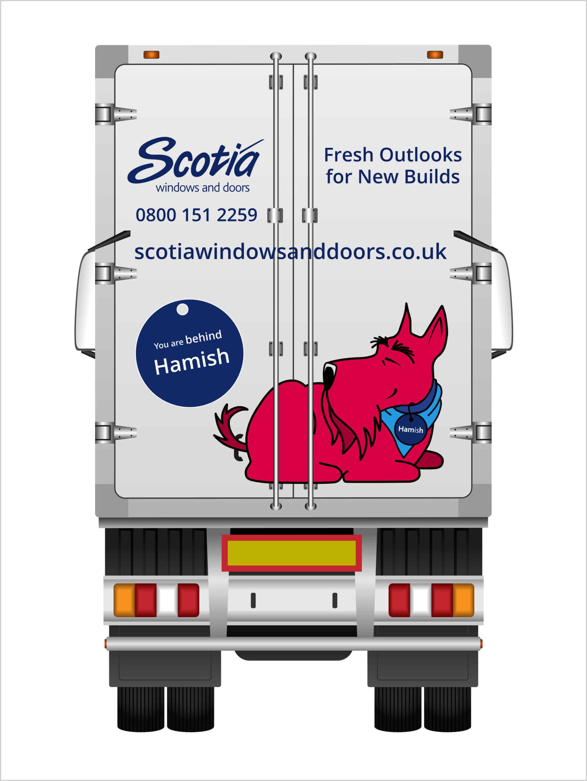
Creating the puppies as cartoon versions…sitting, standing, lying down, with and without a bone! We introduced the pups to the public and trade, as graphic livery on the large Scotia trucks.
– Think of all the times you sat bored in a traffic jam, then you saw a truck next to you with fun graphics and a quirky message …your brand is much more likely to get noticed and be remembered!
Scotia Scottie Dog Hamish showing all of his tricks!
Using the pups in eye-catching advertising to produce great social-media stories that customers love to share.
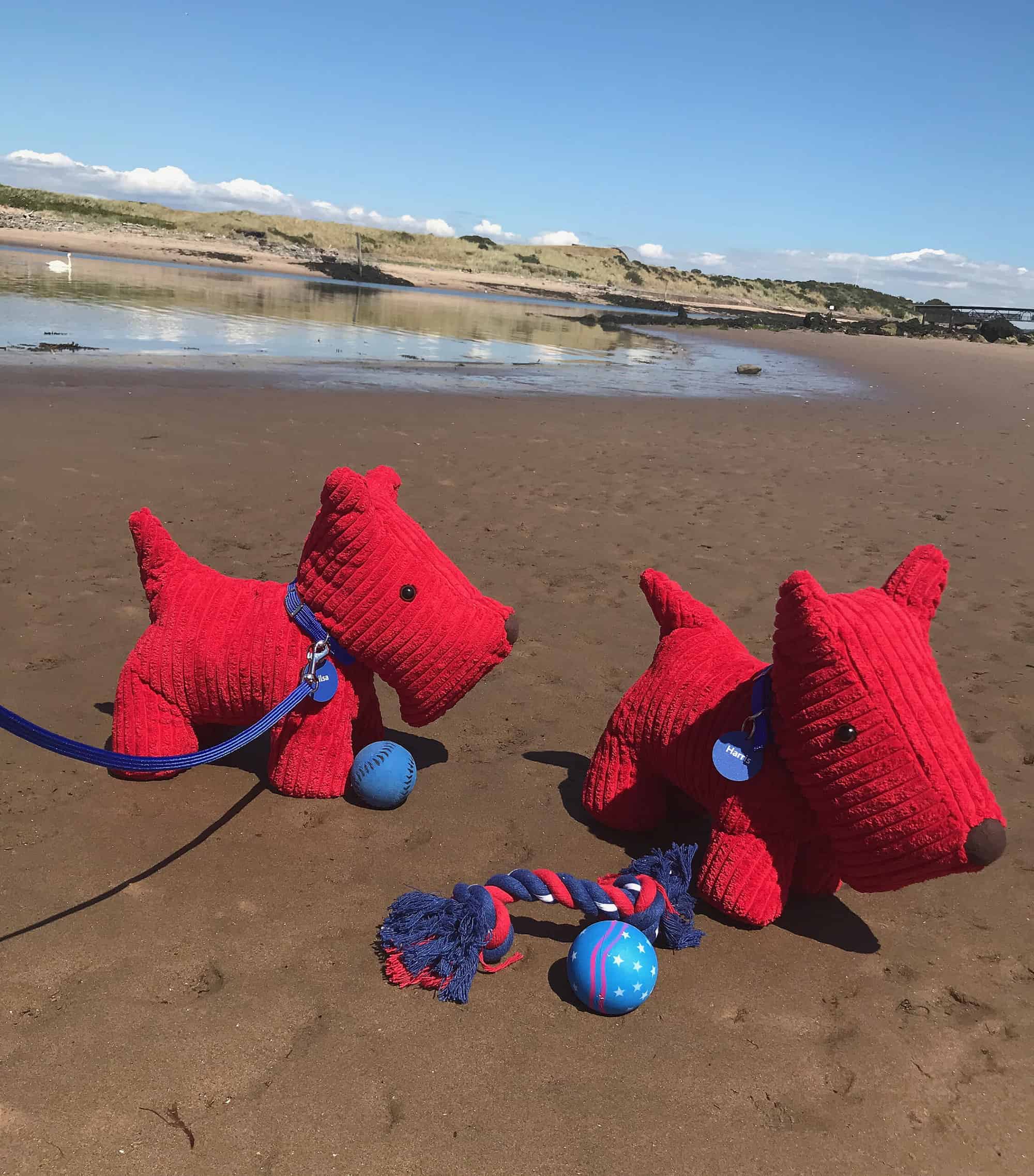
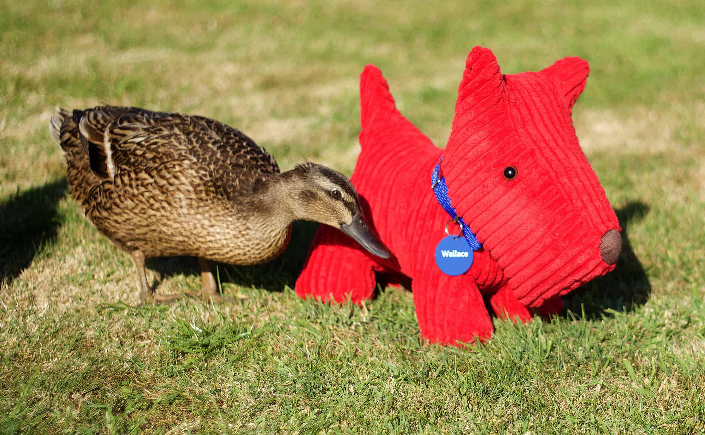
– Take your mascot out-and-about and take photographs in fun, interesting places…make your audience laugh.
Beach day out for Harris and Ailsa Scotia Scottie Dogs
Introducing little pups personalities to your customers, getting your brand noticed!
– Each pup had a name and a personalised name tag, just as a real pup would have, with the company ‘sales’ contact details on the reverse of the tag.
– They also had a card tied to their collars telling you all about their personalities and thanking you for giving them a forever home.
Have fun with your brand and stand out from your competitors call Susan: 07802226937 or get in touch
Beach day out for Haris and Ailsa Scotia Scottie Dogs
Cool Ferfus Scottie Dog Pup
Fergus socialising with the ducks
Litter of 10 Sotia Scottie Dog Pups
Scotia Scottie Dog pup Fergus
Scotia Scottie Dog Hamish
Scotia Your New Build Partner
Scotia Improve Your Outlook – quality products for Scotia
Scotia Improve Your Outlook – the name behind the quality
Creating a stylish, energised space that integrates perfectly with the new corporate branding on its recently completed, world-class £28m Aerospace Innovation Centre.
Spirit AeroSystems is one of the world’s largest manufacturers of aerostructures for commercial airplanes, defence platforms, and business and regional jets.
Eikon Design won the contract to design and project manage the reception area renovation.
From the start, I felt that the refurbished reception area needed to reflect the dynamism and vitality projected by the Innovation Centre.
My first thoughts were that we had to explore ways of using quality lighting and natural daylight on surfaces to create an impressive, engaging experience for visitors.
The colour scheme
I chose a neutral colour scheme that would reflect that used on the exterior of the Aerospace Innovation Centre, which was predominantly silver and grey.
Surfaces – acoustic ribbed felt
Delighted that the stunning Harmony Acoustic Wall Panels used in this project manufactured by Soundtect Ltd are finalists for the Mixology North 22 Product of the Year and Manufacturer of the Year awards.
We wanted to bring the reception area to life with surfaces that had different textures, depending on the light available and where the visitor stood in the room.
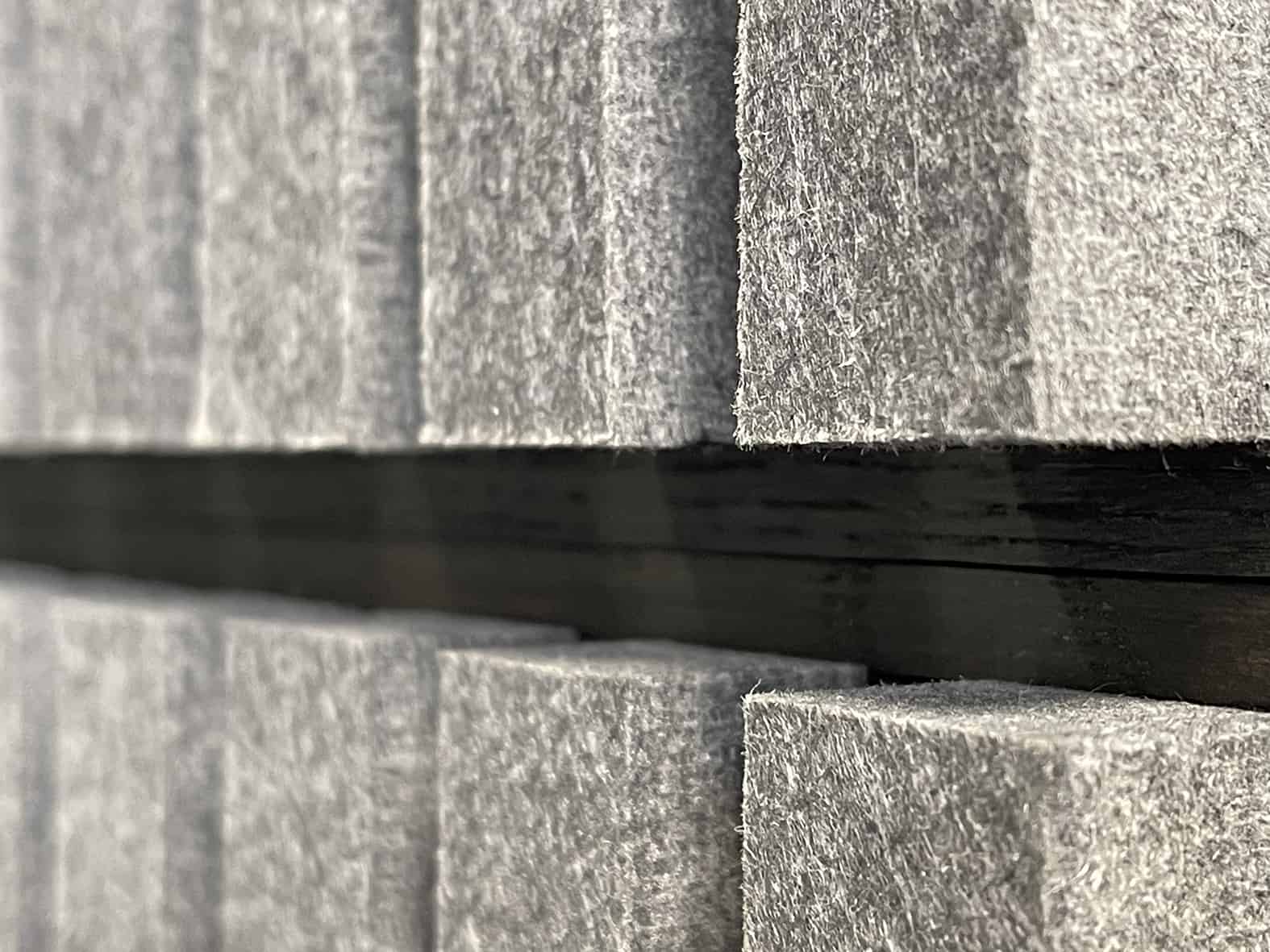
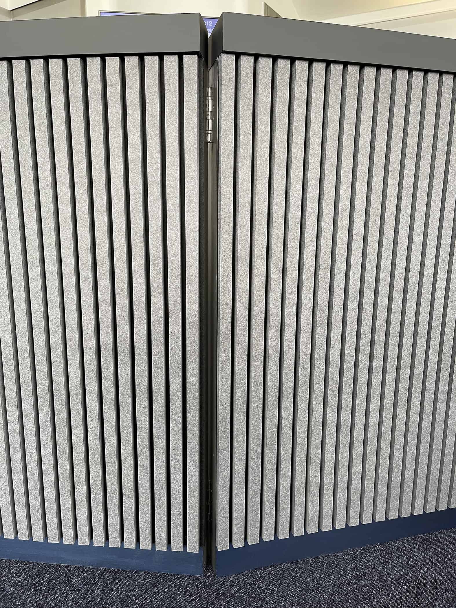
After researching the market, I chose the Harmony acoustic ribbed-felt wall panels which Saxen sourced from the manufacturers, Soundtect. They were the perfect solution – grey fibre ribs on a black backing board.
They had the structure, texture and colour I was looking for. Plus they were hypoallergenic and non-toxic, with up to 1.0 NRC (noise reduction co-efficient) – and they began life as plastic bottles!
The PET (polyethylene terephthalate) bottles were first turned into exhibition carpets and then, at the end of their life, converted back again – carefully re-layering the carpet fibres to create impressive, elegant, acoustic ribbed felt panels.
The acoustic ribbed panels are manufactured with fireproofing built-in, because the original carpet fibres were already fireproof – so this critical safety component is integral to the product and not simply sprayed on.
The Cause was responsible for fitting all the acoustic ribbed-felt wall panels.
The wooden wall panels behind the reception desk and also on the two towers were dated, I decided to repurpose them. So, they were prepped, basecoat applied and sprayed with two beautiful tones of metallic silver by Scottish Architectural Spraypainters. Visual contrast was provided by prepped and coated matt white wall areas.
Lighting
Having found the perfect panelling, we had to consider the lighting and the role it would play.
We worked with Seren Lighting, using a combination of existing products and bespoke lighting in ways which were both innovative and functional – using light to define spaces and surfaces.
Depending on the way they were lit – whether artificial light, natural light or a mixture of both – the texture on the Harmony panels created subtly different moods. Also, as there’s a fair amount of daylight flooding into the reception, the atmosphere of the whole space changed with the passing of time and the amount of daylight.
And as you walked around, both the ribbed and silver metallic panels created different atmospheres depending on where you stood. So my initial concept had been achieved. The space had undeniable energy – no one would have to look at blank, uninspiring walls.
All the lights installed in the project follow ‘circular economy’ principles and can be cost-effectively maintained and serviced – parts can be replaced with no need to throw the whole light away and buy a new one.
The reception desk
For most of the day in summer and for short periods in winter, the reception area is flooded with natural light from two sides, so lighting the reception desk workstation needed a careful response.
The workstation was located behind the reception desk, so using standard lighting methods would have detracted from the overall impression and been unnecessary for long periods. In developing our solution, we followed the basic principle, ‘put light where you want it, when you need it’.
So we ran an LED ultra-effect strip in diffuse profile under the top surface of the reception desk which threw a subtle light onto where the receptionist was working on the computer. The receptionist can switch this strip on or off as appropriate.
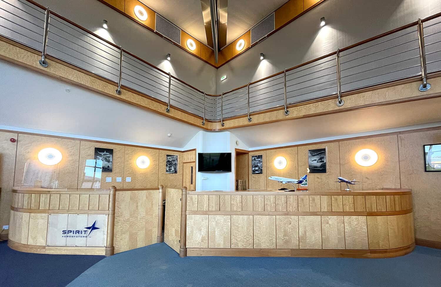
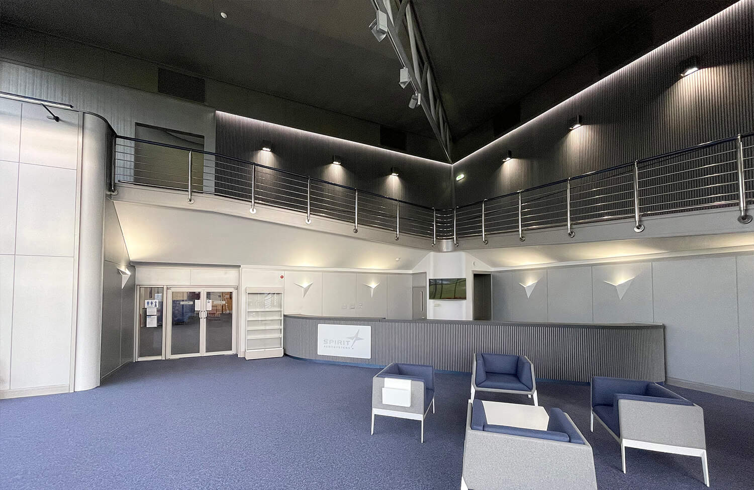
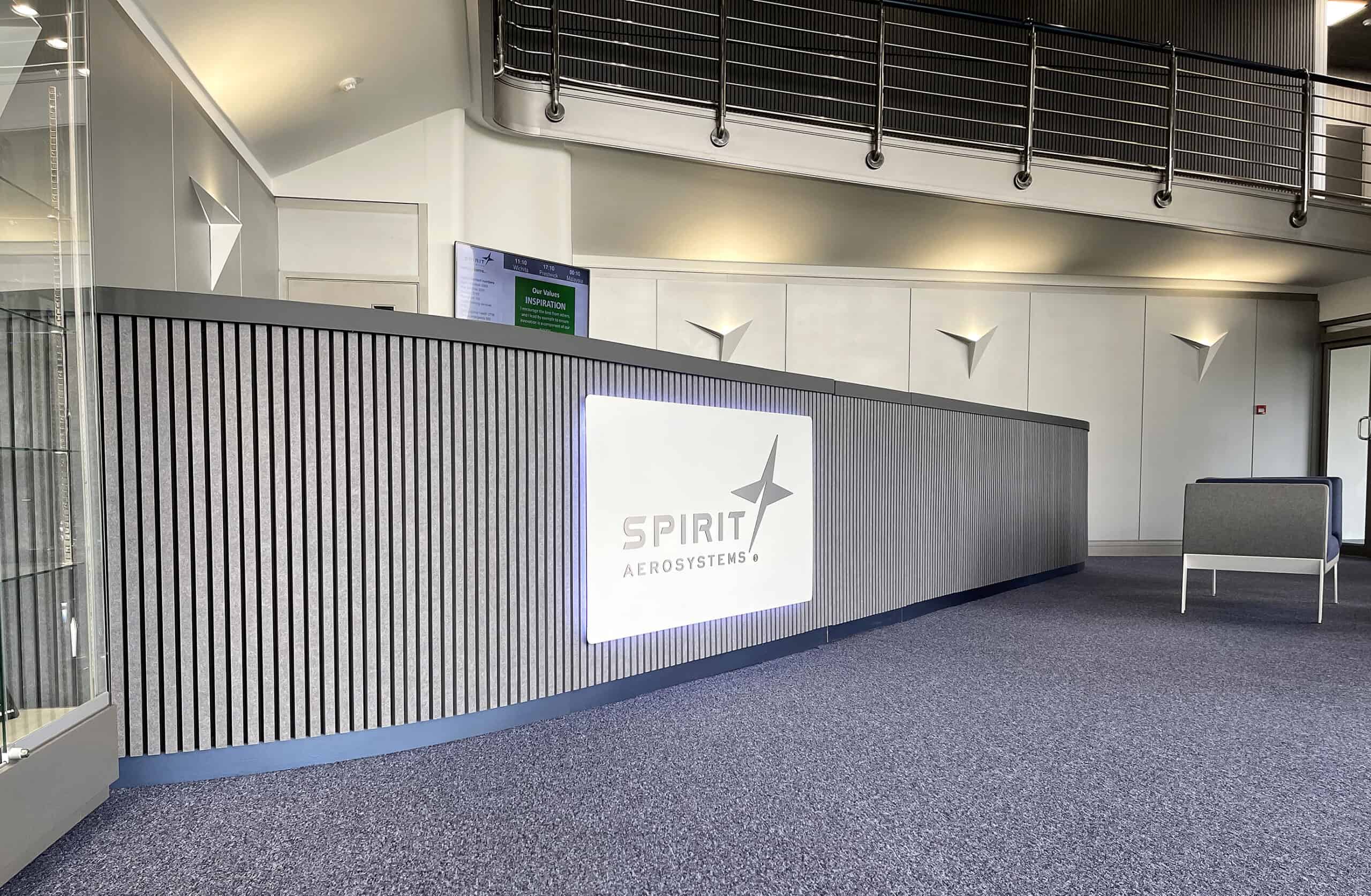
The Cause remodelled and reformatted the reception desk to my design. This involved removing the angled elements and large posts, and replacing them with a concealed door. They also fitted the reception desk surface with a stylish, matt, dark-grey laminate, installing the lighting, graphic panel and ribbed panelling to the front. The panelling’s flexibility ensured a perfect fit around the curve in the reception desk.
The reception desk skirting was painted the same colour as the staircase handrail.
Reception desk refurbishment with concealed door
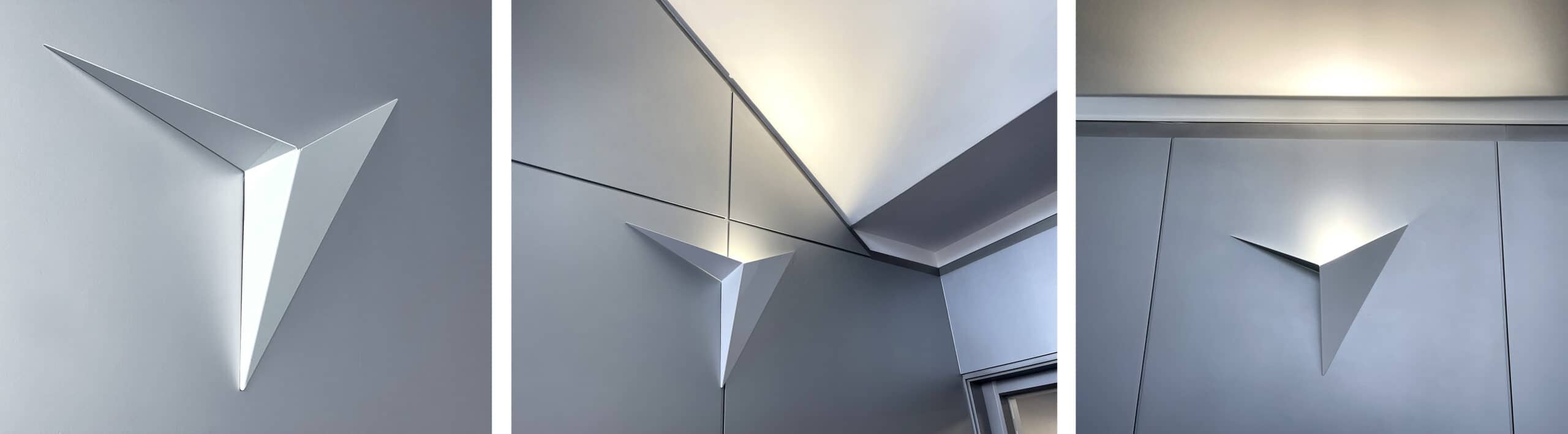
The Wing Lights
I designed and worked with Seren to develop the Wing Lights from first principles.
The Wing Lights deliver light upwards, so it bounces off the various surfaces to enhance the textures and reflective differences. They also project a visual link to the ‘star’ element of the Spirit AeroSystems logo.
White Wing-light Wall Uplighters
It took several attempts to create the final geometric shape; however, the Wing Lights now act as dramatic focal points within the space, capturing the essence of Spirit AeroSystems’ business and my overall design vision.
Ceiling
The existing suspended ceiling was off-white in colour and looked rather tired. I had it spray-painted with a dark metallic silver. This transformed the appearance of the ceiling and changed the whole look of the reception area.
Lighting the upper-level walkway
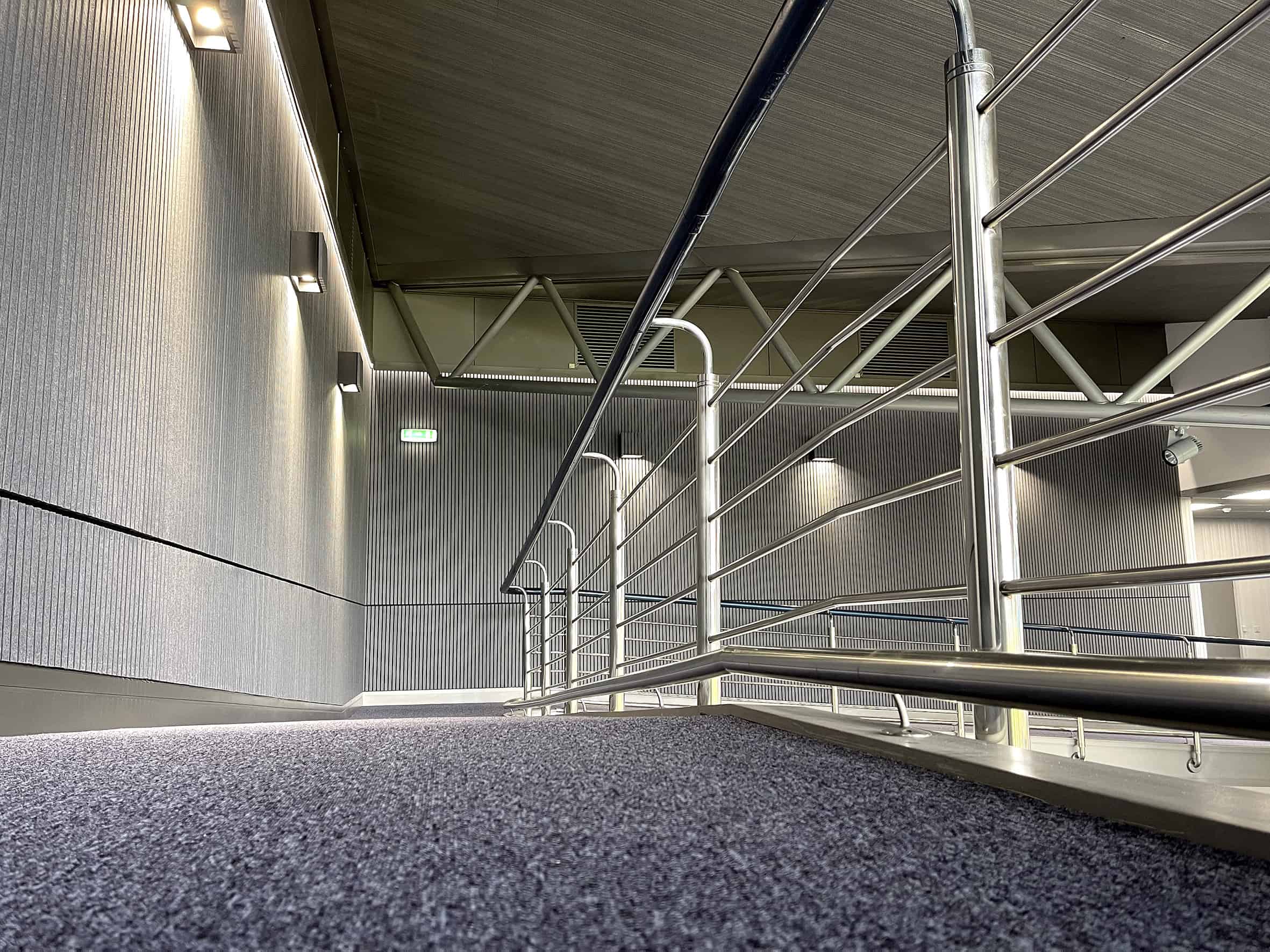
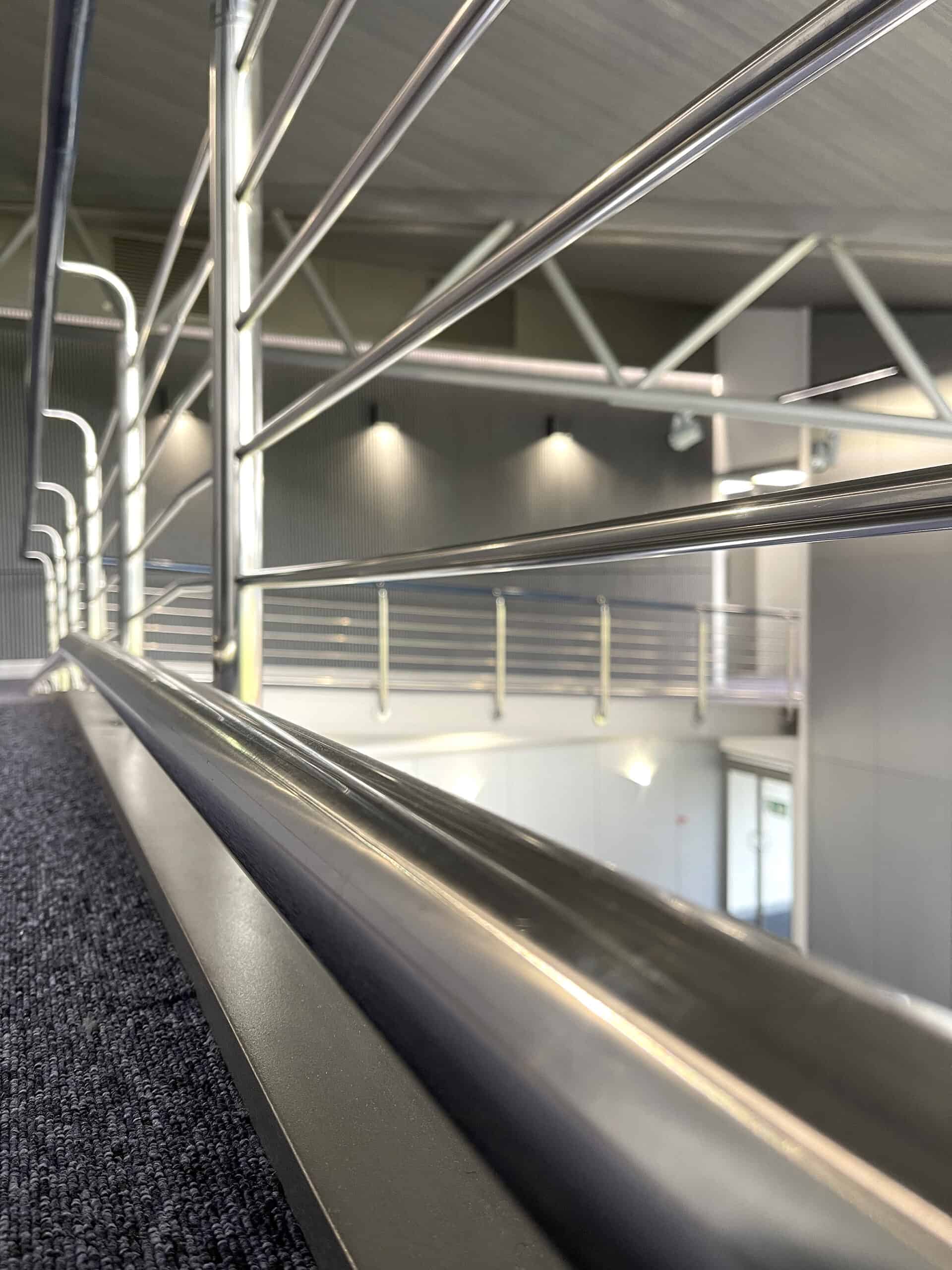
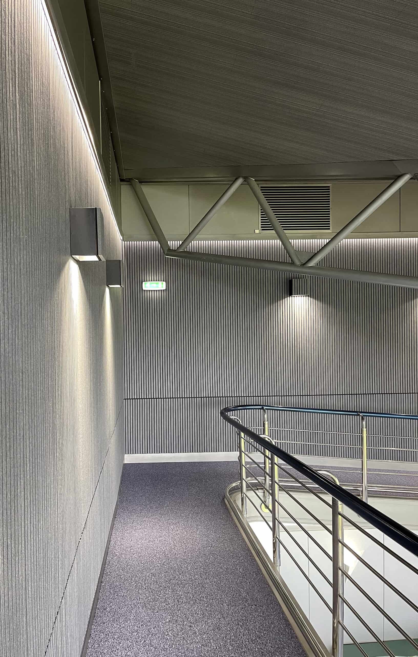
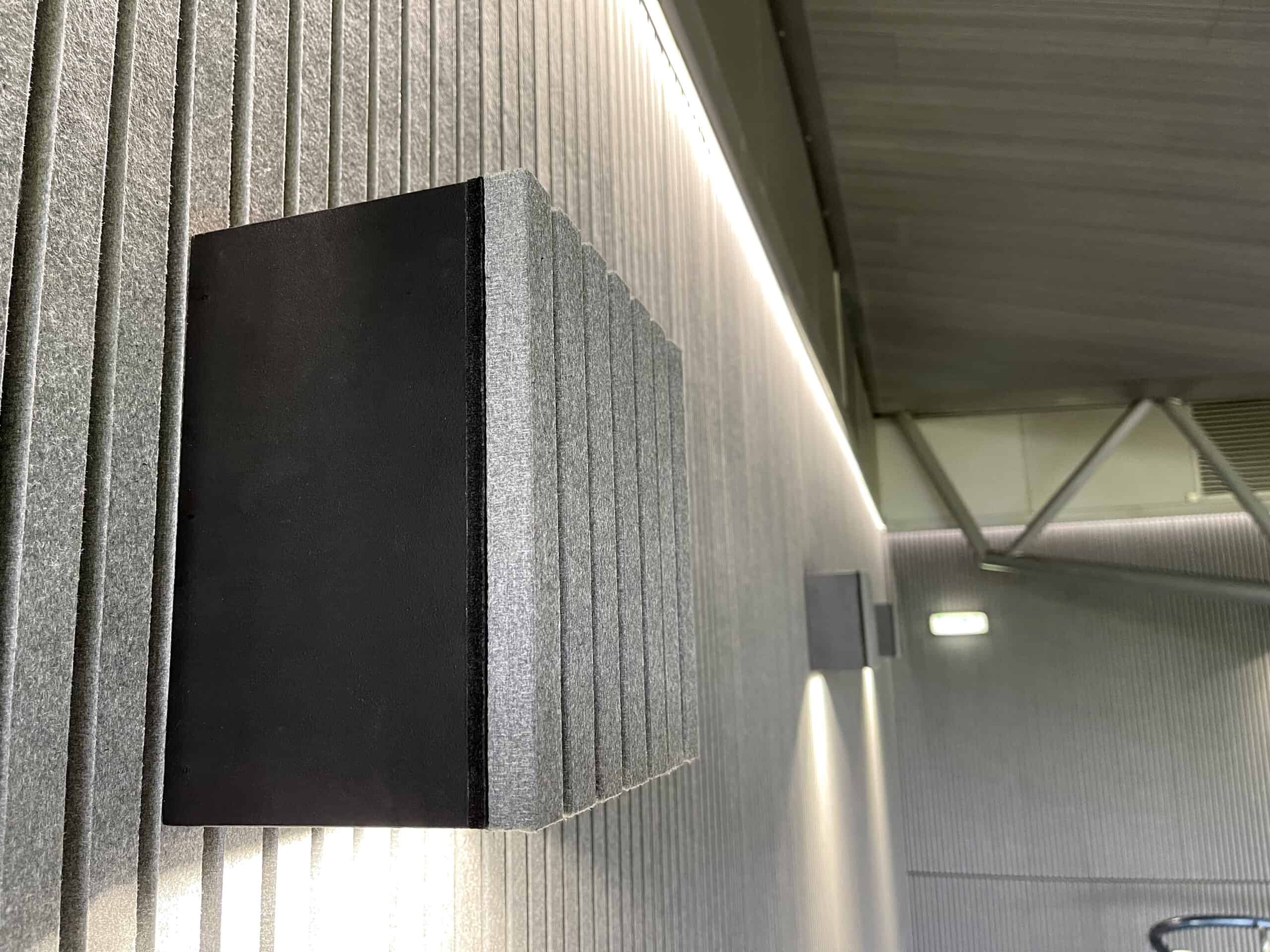
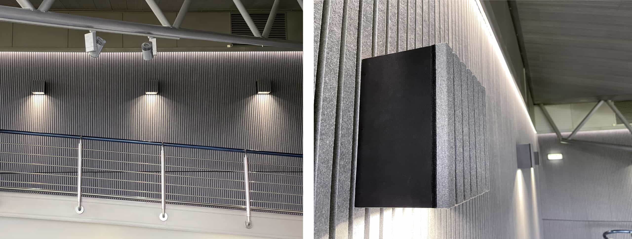
There were issues with uneven wall surfaces on the upper-level walkway. Our solution was to apply architecturally inspired Harmony ribbed felt panelling, lit by dramatic custom-made LEDs, to create the total effect – an utterly stunning, modern wall.
LED Gimbal and Cob downlighting
The lights used were twin gimbal heads – round lights that can swivel in two directions. These were specially adapted from standard lights in the Seren range. The twin gimbal heads were installed in false pockets, clad with ribbed felt. They provide functional lighting to the walkway, while adding a dramatic effect on the wall panelling.
Finally, a pelmet was constructed to conceal a new LED Cob profile, allowing it to wash diffused light between the ribbed features of the Harmony panelling.
The panels above the pelmet were spray-painted silver – the same colour as the ceiling – to give a much more dramatic effect.
Other features…
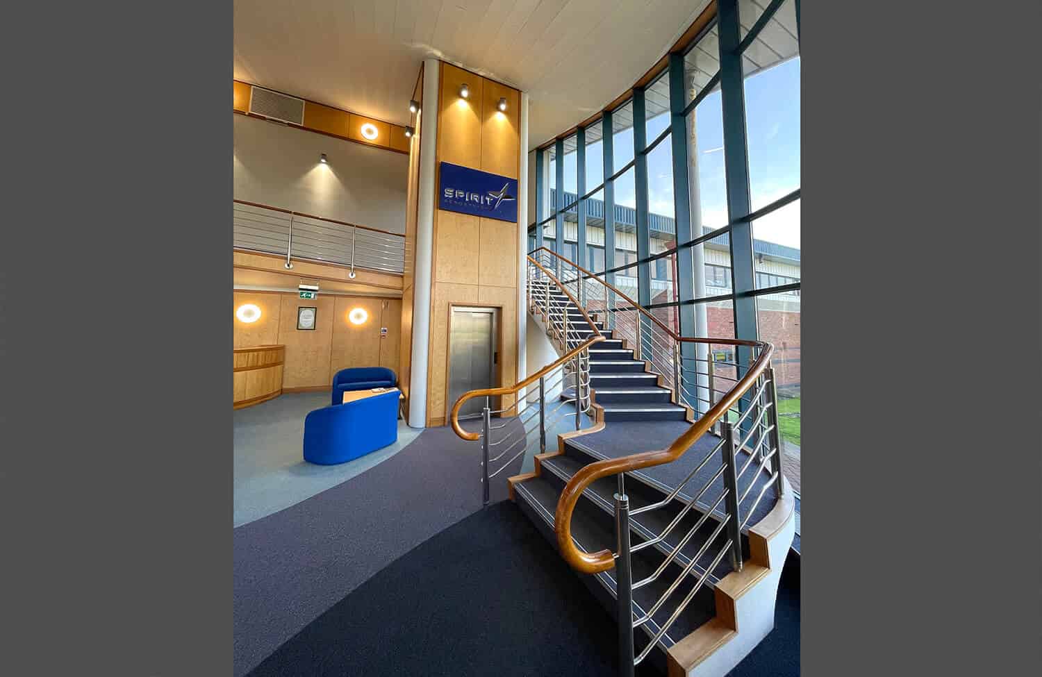
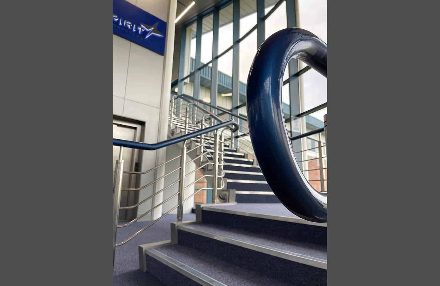
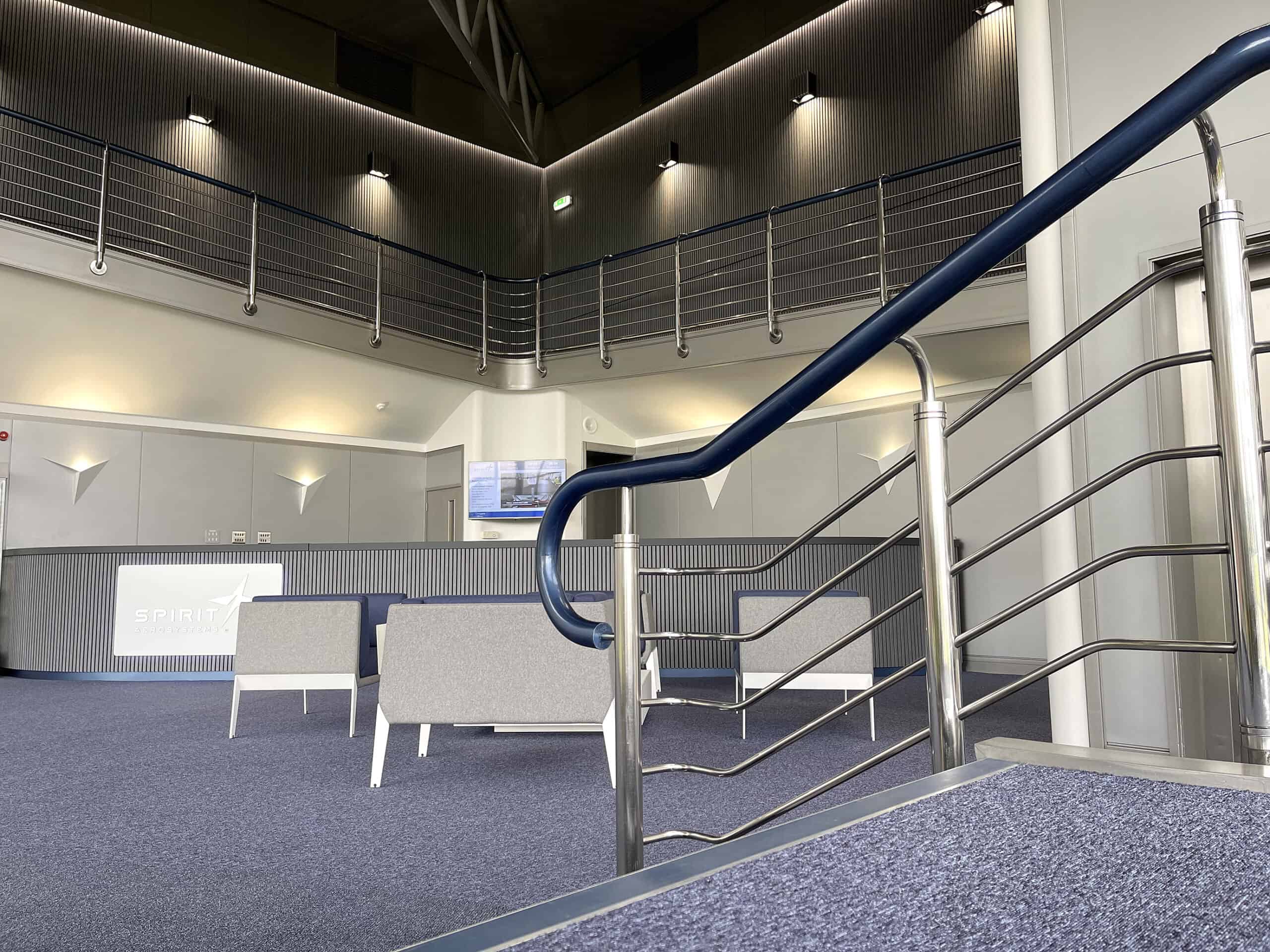
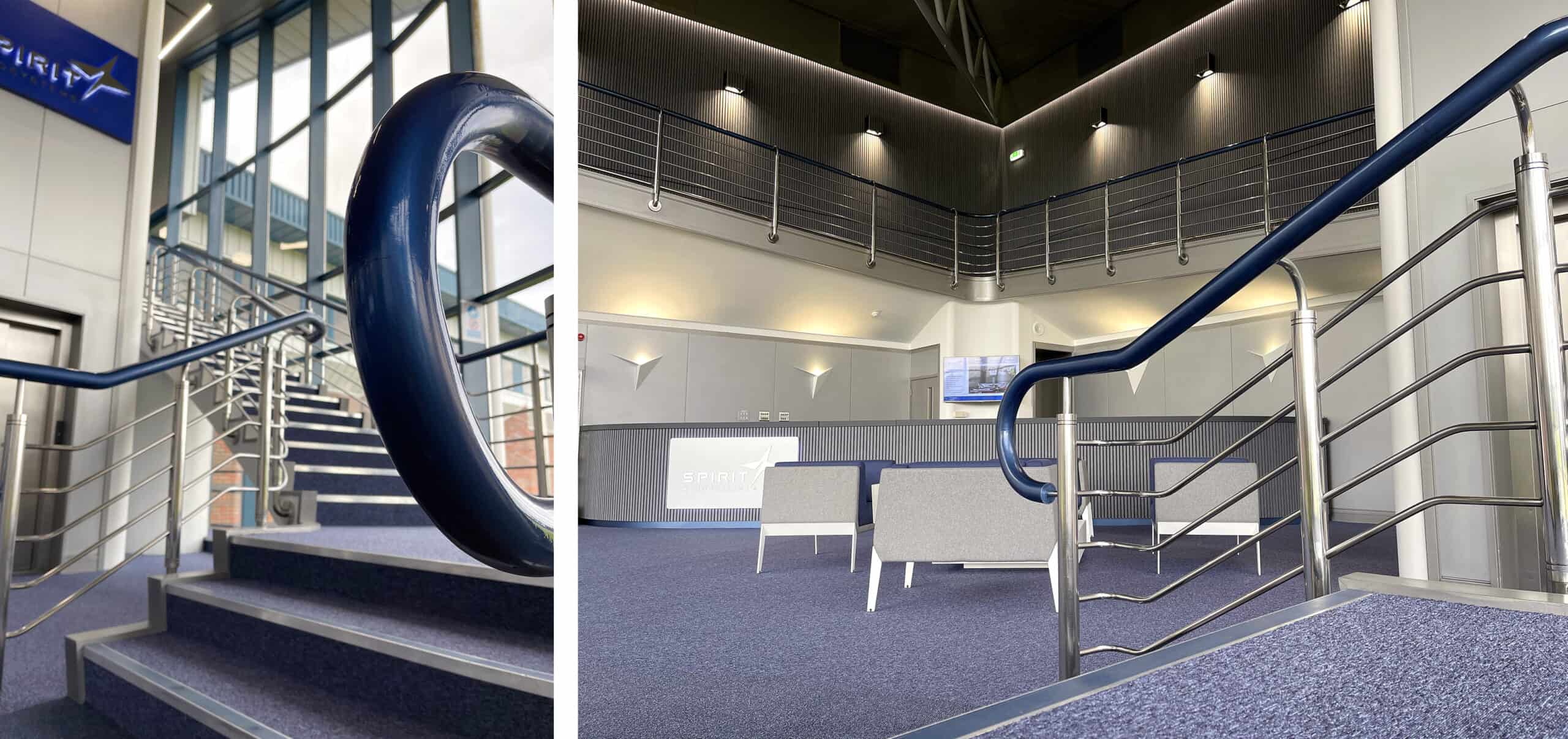
The wooden bannister handrail was stripped back and layered with different metallic colours to give a changing surface effect with different shadows and highlights. It was then coated in a high-gloss lacquer. This introduced an accent of colour, which also reflected the company’s corporate colours.
Specialist lacquered metallic paint finish on wooden bannister handrail
Structures
Dominating the reception area are two high columns, one of which contains a lift.
Given the solidity and simplicity of the shapes, I decided on a lighting solution that would create an architectural feel. We used beam-controlled light bars at the top of the structures to project a subtle wash down the full length of the columns.
Carpets and furniture
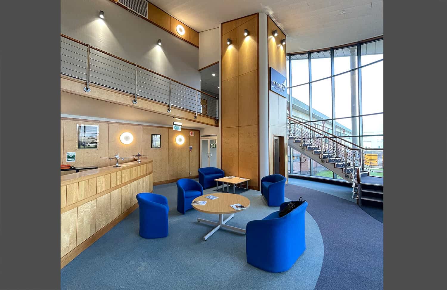
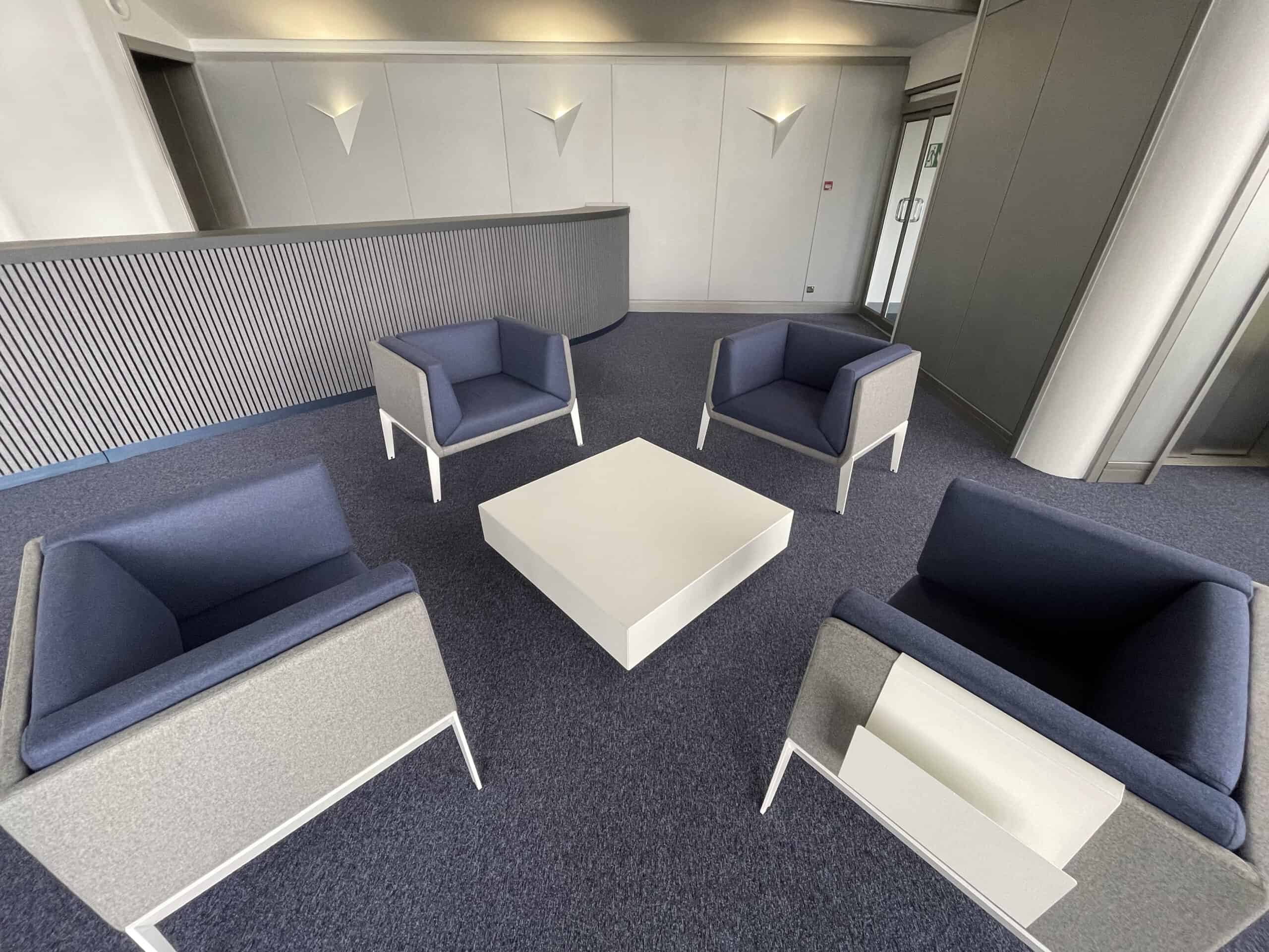
The existing carpet tiles were removed and upgraded. They were colour coordinated with the new, striking Italian Quadrifoglio furniture, sourced through Saxen.
This furniture was the cornerstone of my vision, and its style, shape, colours and textures tie the space together.
Stunning Quadrifoglio Accord range of furniture
Conclusion
The success of the project was very much down to careful planning, creative thought and good people working together.
Before
After
Before
After
Before
After
Previous
Next
The good people
Throughout the project, I worked closely with a number of excellent companies including:
Saxen Furniture – a leading supplier of commercial interior solutions.
Scottish Architectural Spraypainters (SAS)
Seren Lighting – a UK manufacturer of innovative, high-quality LED lighting.
The Cause – refurbishment, lighting and sound experts.
Ensure your reception area is a stylish, energised space by calling Susan on 07802 226 937 or email: sanderson@eikondesign.co.uk
Spirit Aerosystems Reception
Custom lighting design at Spirit Aerosystems reception
We were delighted to be invited by Spirit AeroSystems to provide the set design, staging, branding, video projection, lighting and audio systems that would work effectively in this vast manufacturing space.
Our challenge was to create a focal point for the official ceremony that would not look lost in this massive area, with effective lighting in a room flooded with daylight and quality sound without feedback. Achieving all of this within a tight deadline.
We highlighted the machinery within this area with blue wash effect lighting, applied vinyl AIC logos onto the walls and worked at height on an articulated access platform to apply vinyl decals onto large machinery.
Our team supplied and installed ten 55-inch TV monitors for the collaborative partners’ exhibition areas to promote their progressive innovations to Nicola Sturgeon and invited guests as they toured the new facility.
Eikon passed with flying colours!
Our clients like the way we work with them from the concept stage. We really can do the whole thing – working with our sister company, The Cause (Light and Sound).
To talk over how we can transform your official opening, call Susan on 07802 226937 or email: sanderson@eikondesign.co.uk
Spirit AeroSystems Aerospace Innovation Centre stage and set for official opening
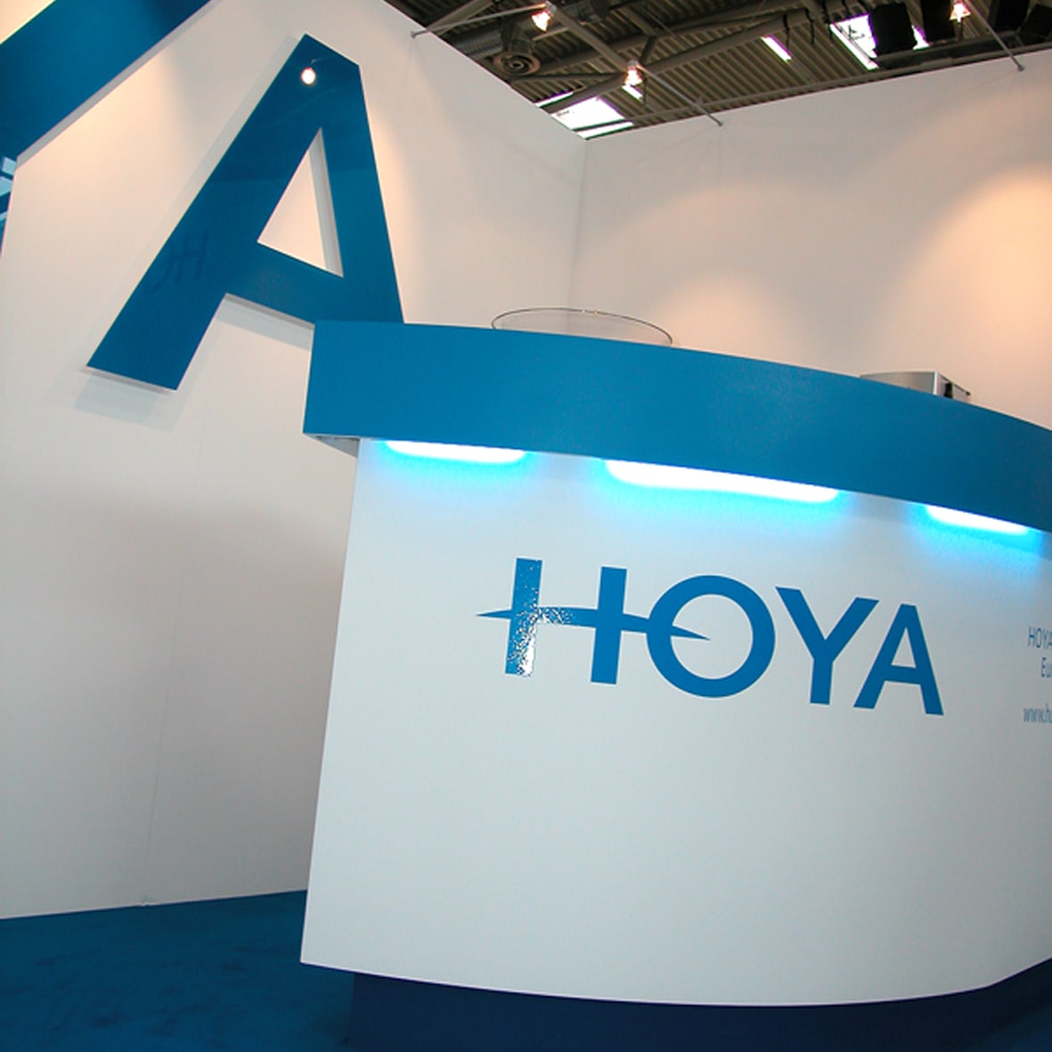
The HOYA Corporation has such a strong Brand Identity so we designed a custom built exhibition stand that was simple, functional and visually effective for a stand of its size.
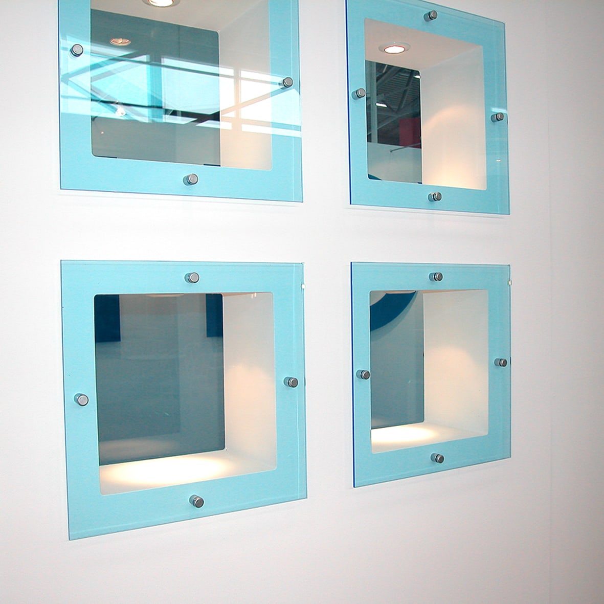
Please click on the images below for more explanation on each stand element.
Trust Eikon to design, build and install your next successful exhibition stand!
For more information on custom stand design please call Susan on 07802 226937 or email: sanderson@eikondesign.co.uk
HOYA Corporation Exhibition Stand Design and Build
Custom built curved wall for HOYA exhibition stand
Hoya custom built wall to display product at Semicon Europa
HOYA high gloss acrylic display letters set on risers
DuPont custom exhibition stand designs for Semicon Europa, Munich
We worked with EKC Technology for many years, originally producing large graphic panels and graphic light boxes that were used on their hired shell system at Semicon Europa.
We were then invited to design, build and install a unique two story exhibition stand for Semicon Europa, Geneva. Our solution was a circular stand design with a central spiral staircase, inspired by elements from the EKC logo.
The event then moved to Munich and EKC joined DuPont. We increased the stand size to 4m x 6m and retained the spiral staircase. The venue safety rules changed and we were no longer able to have a spiral staircase…the challenge was on to redesign the stand. We removed the spiral stairs replacing them with a central staircase and adapted the layout to increase the meeting areas available at the event.
You can see the design evolution in the images below.
Trust Eikon to design, build and install your next successful exhibition stand!
For more information on custom stand design please call Susan on 07802 226937 or email: sanderson@eikondesign.co.uk
EKC Technology circular two story exhibition stand at Semicon Europa, Geneva
EKC Technology exhibition stand design with central spiral staircase
DuPont exhibition stand design, Semicon Europa
DuPont exhibition stand design 4m x 6m
DuPont exhibition stand central spiral staircase at Semicon Europa
DuPont exhibition stand at Semicon Europa, Munich
DuPont exhibition stand design and brand graphics
DuPont exhibition stand with central external staircase at Semicon Europa, Munich
DuPont exhibition stand at Semicon Europa, Munich
DuPont exhibition stand upper floor meeting area at Semicon Europa, Munich
DuPont exhibition stand design 4m x 6m front and rear view
an original theme at a beautiful corporate event venue creates a truly memorable event…
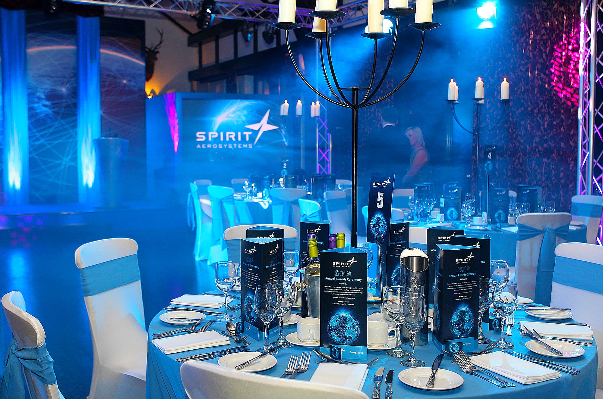
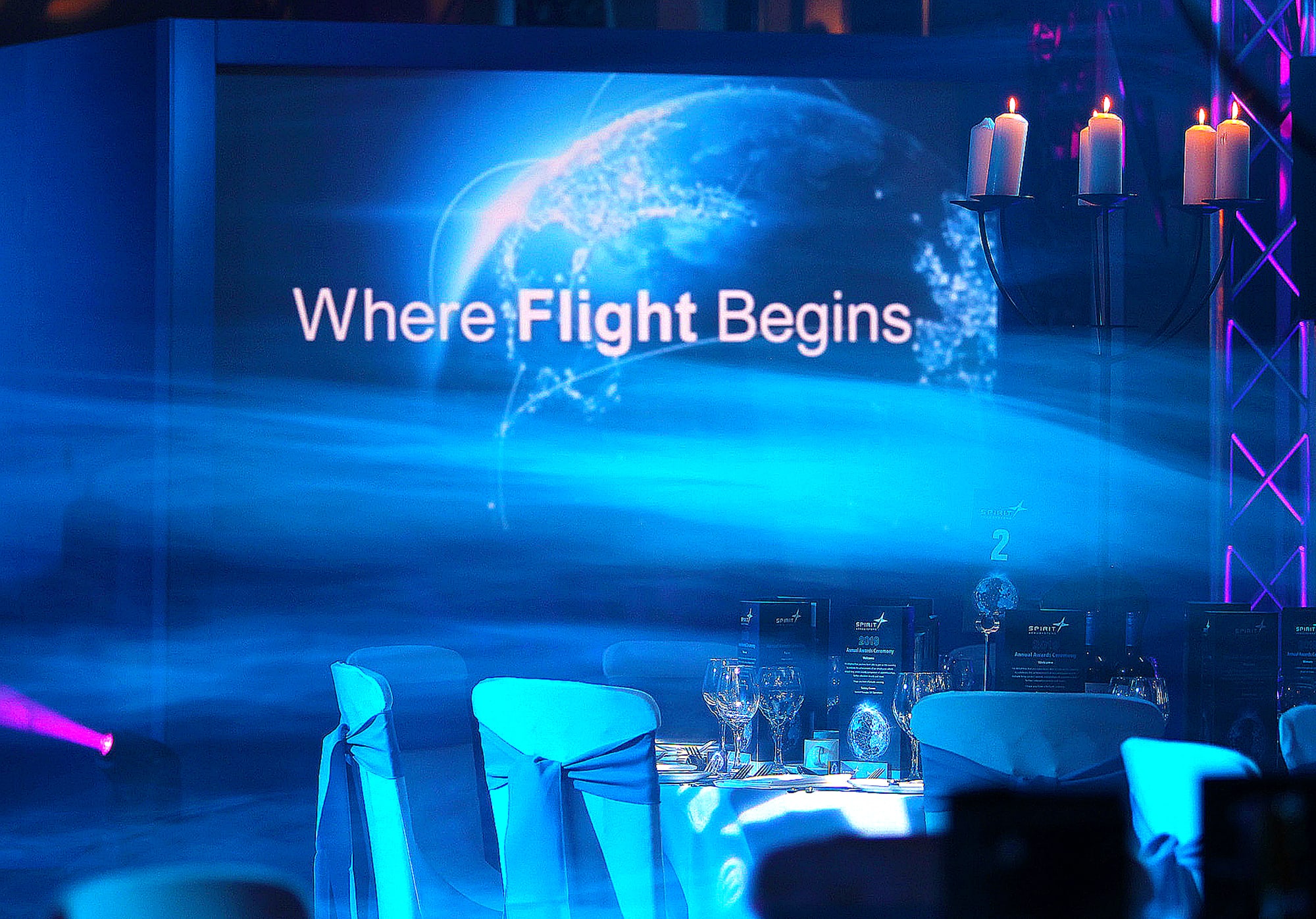
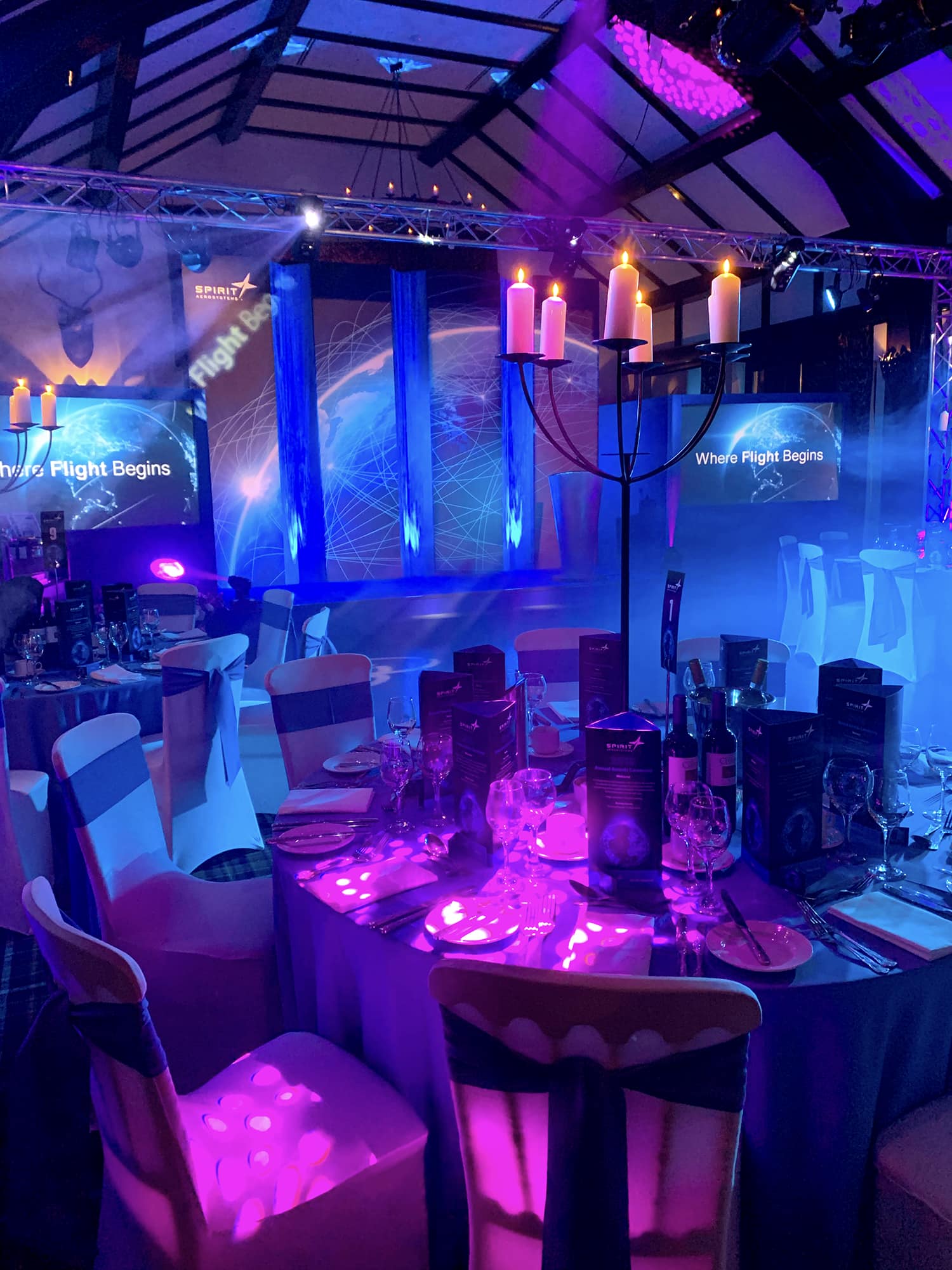
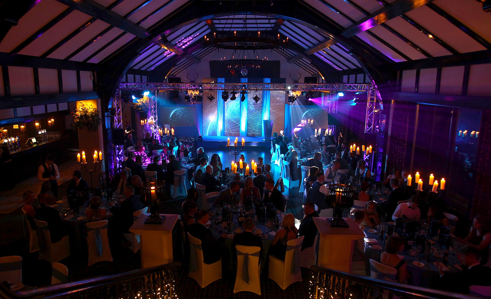
The annual Spirit AeroSystems award ceremony was held at the iconic Brig o’ Doon House Hotel in Ayr – the birthplace of Robert Burns.
The high vaulted ceiling gave us great creative scope when designing the event. After guests entered the awards ceremony from the top of the hotel’s dramatic, sweeping staircase, they walked down to become immersed in an atmospheric ‘global success’-themed setting.
We can do it for you.
Whatever the size and scale of your event, Eikon Design can communicate the values and persona of your brand through a creative combination of lighting, sound and sets.
We can provide all kinds of expert advice, helping you weigh up the options to choose the most powerful theme – before integrating it into every aspect of your event.
Eikon’s expertise is also available when choosing an impressive or interesting venue. We’ll make sure that the venue is consistent with your brand and chosen theme, and one which also helps sell the event itself.
Our clients like the way we work with them from the concept stage. We really can do the whole thing – working with our sister company, The Cause, to provide lighting, audio systems, set design, staging and branded print items right through to on-site event management on the big night.
‘Fantastic branding by Eikon Design and stage management by The Cause! Brilliant team to work with too! Highly recommended for any event!’
The Five Sisters Bings (an industrial heritage site) became the seed from which to grow the new brand for West Calder. Shale bings are only found in West Lothian.
The West Calder brand design was adapted to reproduce well in signage large and small, as black and white boundary signage, finger post signage columns, external display cases and be in keeping with the look and feel of West Calder historic village. Providing a great method of presenting valuable information and guiding pedestrians in towns, cities, parks and more.
Call us on 07802 226937 or get in touch with Susan to arrange for us to meet with you to chat through your Brand Identity and Sign Design requirements.
Eikon’s challenge was to create a timeless logo for Simpac that did not restrict the company’s product diversification going forward.
The chosen design, supporting strap-line “Pack. Bag. Wrap.” and the positioning statement “Simpac produces high-quality, tailored, competitively-priced packaging, bagging and wrapping solutions for the UK and internationally, including retail, food, industrial, agricultural and domestic applications” give a clear understanding, at a glance, of the services and sectors Simpac cover.
The idea behind the logo was to show a notch cut out of the red solid block, in a similar way you would when tailoring a garment, allowing elements to come together accurately, resulting in high-quality products and custom service tailored to each individual product requested by their customers.
What Simpac experienced…
During the creative process of designing our new website it became apparent that our existing company logo design was beginning to look dated. After discussions with company directors we asked Eikon Design to review the font style, colours and logo as they have considerable expertise and knowledge in Brand Design.
We asked Susan to create a new modern logo that also gave a nod to the Simpac history. Our old logo represented a carrier bag, but with the company now offering a much greater range of products, from paper sacks to kitchen foil, it was agreed that a more generic logo would be more appropriate.
Susan presented a wide range of logo designs showing various shapes, colours and fonts, and accurately described her thought process for each one. The main company stakeholders were unanimous in the decision to proceed with red and black as our new corporate colours, which we think are strong, bold and timeless. Red and black were also our corporate colours originally, so her suggestion was ideal. Susan carefully listened to our creative requests and we all agreed to keep continuity in the brand by keeping the same font style.
We are simply thrilled with our new eye catching and modern logo, and have received great feedback from shareholders, employees, customers and independent marketing experts.
Thank you, Eikon Design!
Kick your brand into touch by calling Eikon Design NOW: 07802 226937 or get in touch
It was important to keep a link with the existing TCS brand – 117 years in business WOW!
The diamond symbol was synonymous with TCS, so we felt it was important to keep that visual link to the history of the company.
As you can see the new logo design builds up from a firm foundation to the solid red diamond – giving the illusion of a three dimensional structure.
We have used their new brand design in an animated PDF brochure for our client to use as an introduction to the company and services – if you would like to view this animation sequence please right clickhere and choose (save link as) to save the PDF to your desktop. This file must be opened in Adobe Reader to view animation.
“We were delighted with the professional service provided during the design development and the delivery of our final suite of re-branded logo / business cards / brochure / display roller banners / signage: Eikon Design are clear, concise and professional”
Call us on 07802 226937 or contact us to arrange for us to meet with you to chat through your Brand Identity.
Eikon Design produced McKie’s logo design, marketing presentation folder, business cards and website
As a company, who are extremely client focussed, and are known for their experience, professionalism, expertise, commitment, flexibility and positive attitude – McKie’s need a new brand and website to match this.
Eikon Design created a strong contemporary brand – a logo design that is bold in appearance and colour.
Invest in a new brand identity, please call Susan on 07802 226937 or send us your details








 Reception desk refurbishment with concealed door
 White Wing-light Wall Uplighters
 LED Gimbal and Cob downlighting
 Specialist lacquered metallic paint finish on wooden bannister handrail
 Stunning Quadrifoglio Accord range of furniture